Learn How to Write with a Brush Pen
Book 3:Clerical Script
Wang Ronghua
Opening Remarks
I presume you have gone through Book 1, a general introduction to Chinese calligraphy;
I presume you have gone through Book 2, which teaches you regular script;
I presume you have an impulse to learn more.
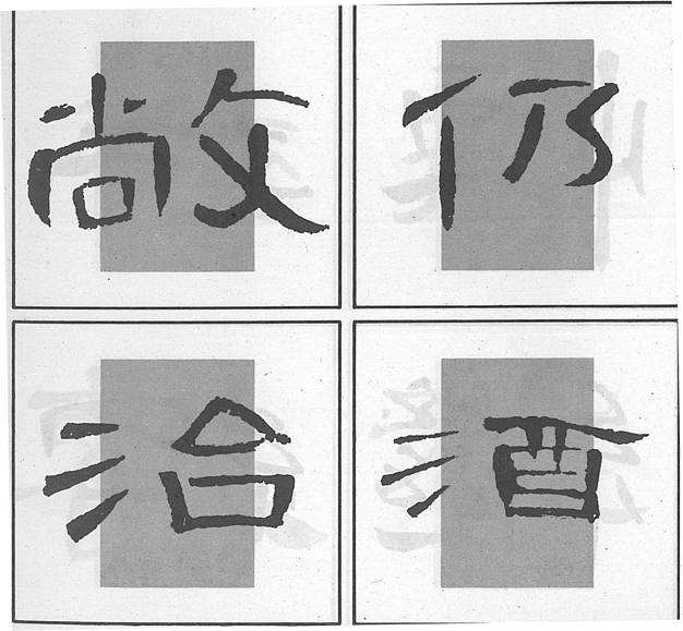
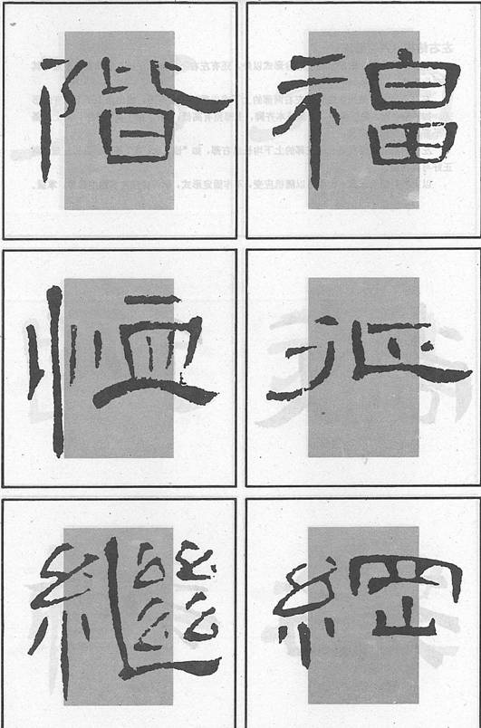
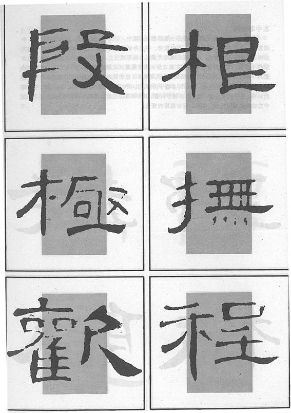
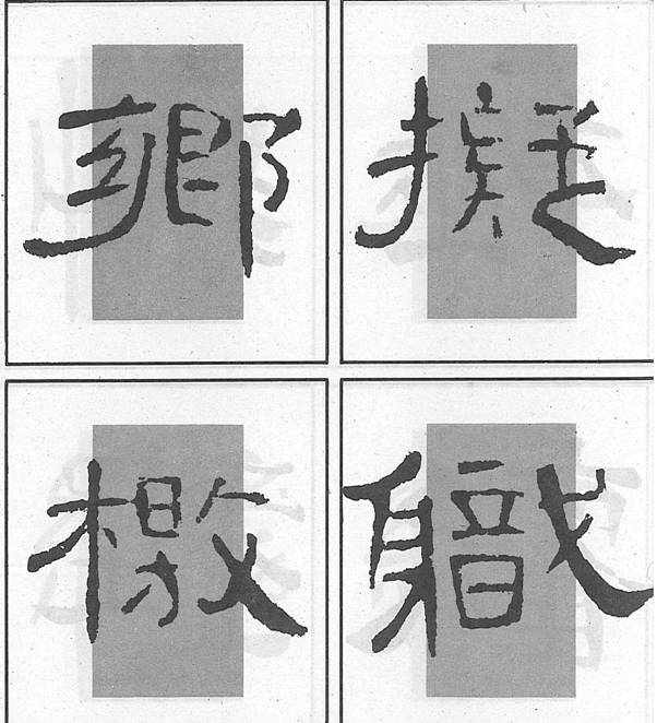
About Cao Quan Stele (曹全碑)
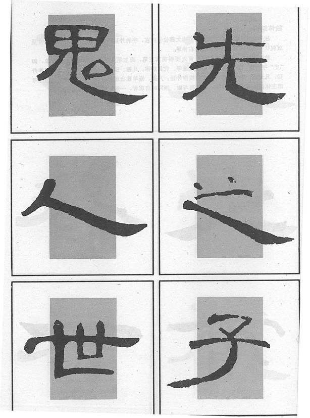
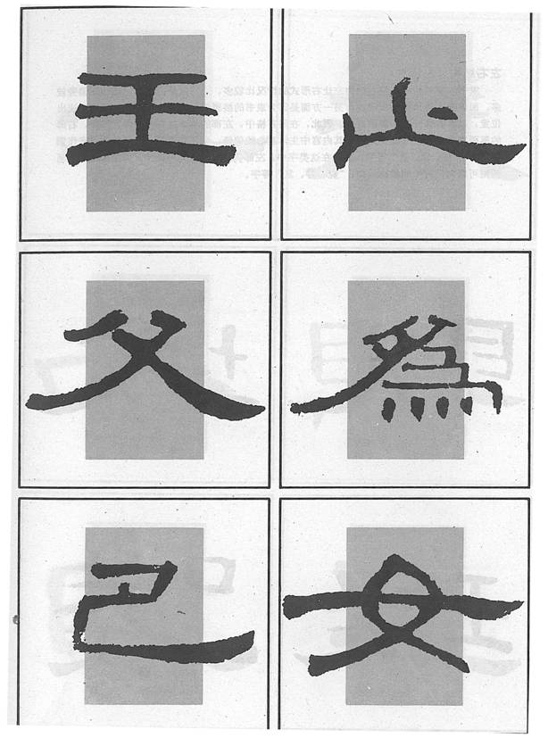
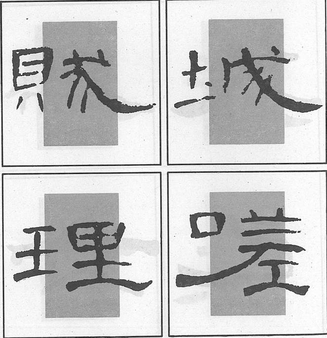
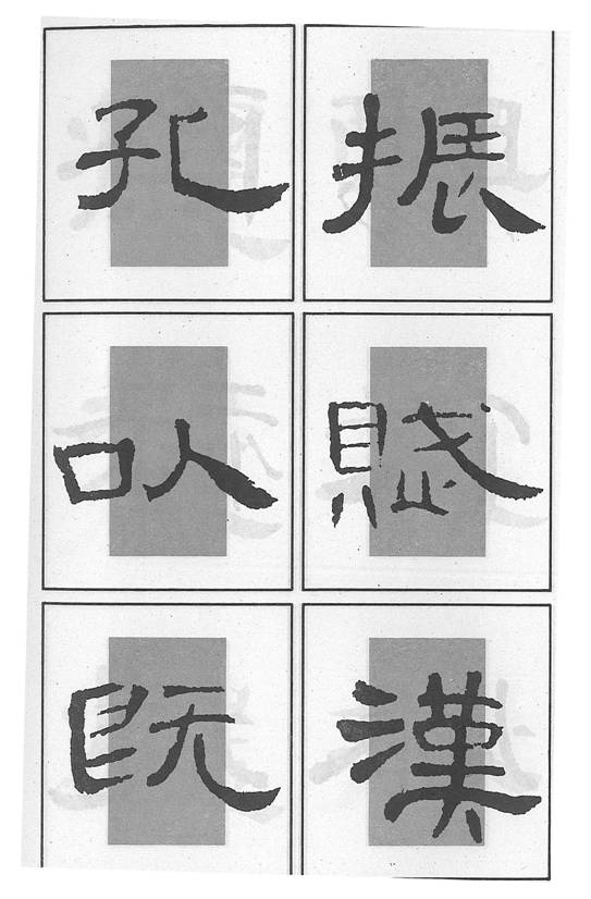
We shall use Cao Quan Stele as a model for learning clerical script.
This stele was erected in the year of 185 by Wang Chang to record Cao Quan’s deeds. It was excavated at Hexian County of Shanxi Province in the early years of the reign of Emperor Wan Li. It is now being kept at Xian Stele Forest. The stele is 253 cm in height and 123 cm in width. The frontage has 20 lines with 45 characters in each line. It has been regarded a master piece among Han stele calligraphy for its elegant stroke compositions.
Three Key Links in Writing a Stroke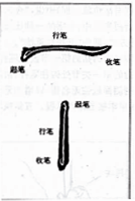
The three links are:
1) starting a stroke (起笔 qǐ bǐ)
2) executing a stroke (行笔xīng bǐ)
3)finishing a stroke (收笔 shōu bǐ)
There are two ways to start a stroke: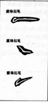
Tip-in (藏锋 cáng féng)
Tip-out (露锋 lù féng)
There are two ways to finish a stroke: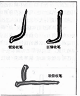
Tip-in (回锋,顿势 huí féng; dùn shì),which is usually slow with strength;
Tip-out (出锋,轻势 chū féng; qíng shì),which is usually fast with less strength.
Kinds of Strokes
In general strokes are divided into 8 kinds:
1. dot;
2. horizontal stroke;
3. vertical stroke;
4. hook;
5. left stretching stroke;
6. right stretching stroke;
7. an elbow;
8. an up-ward stroke.
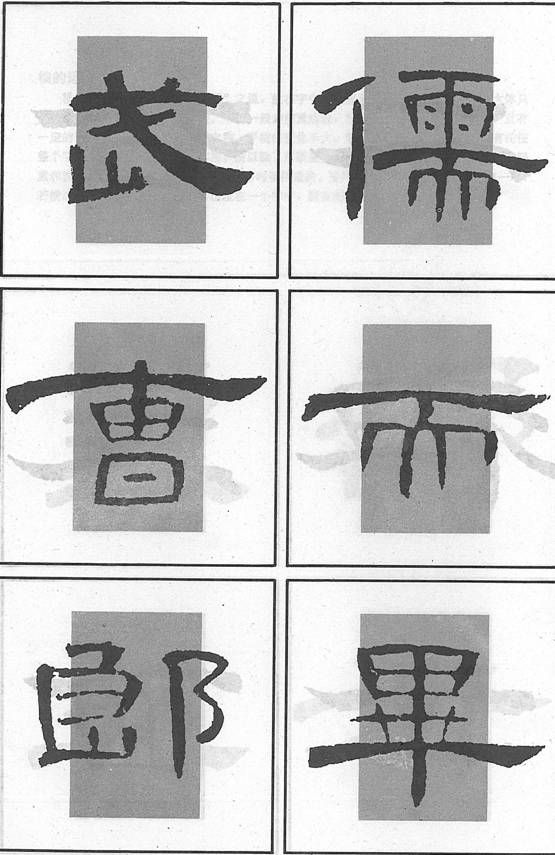
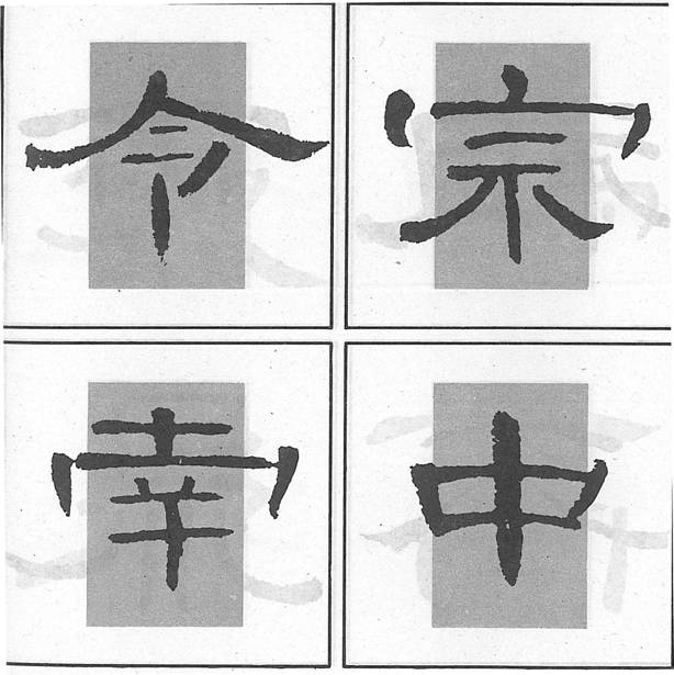
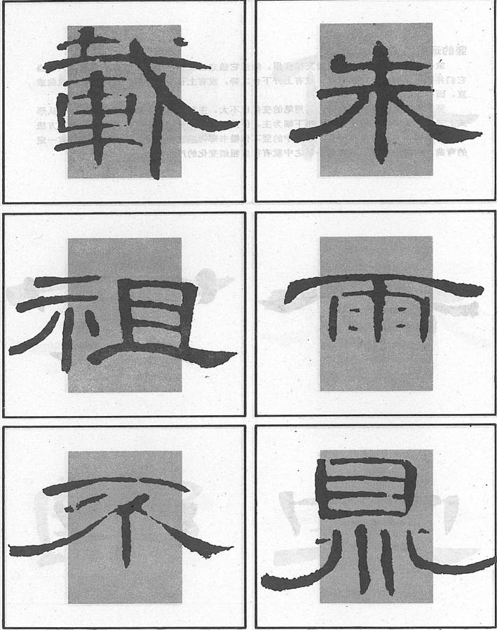
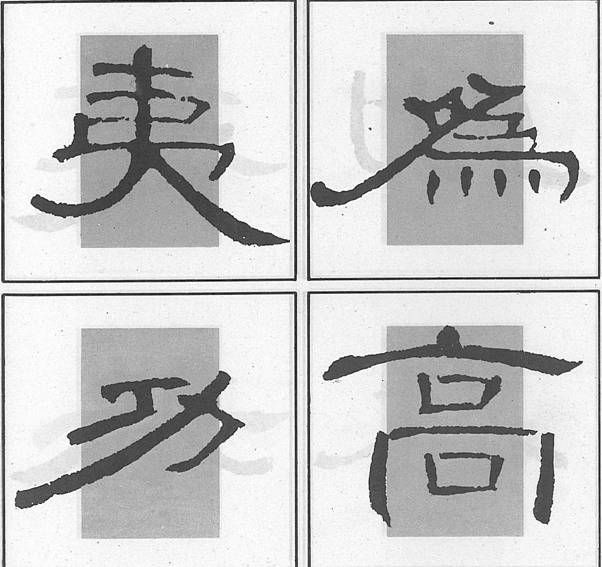
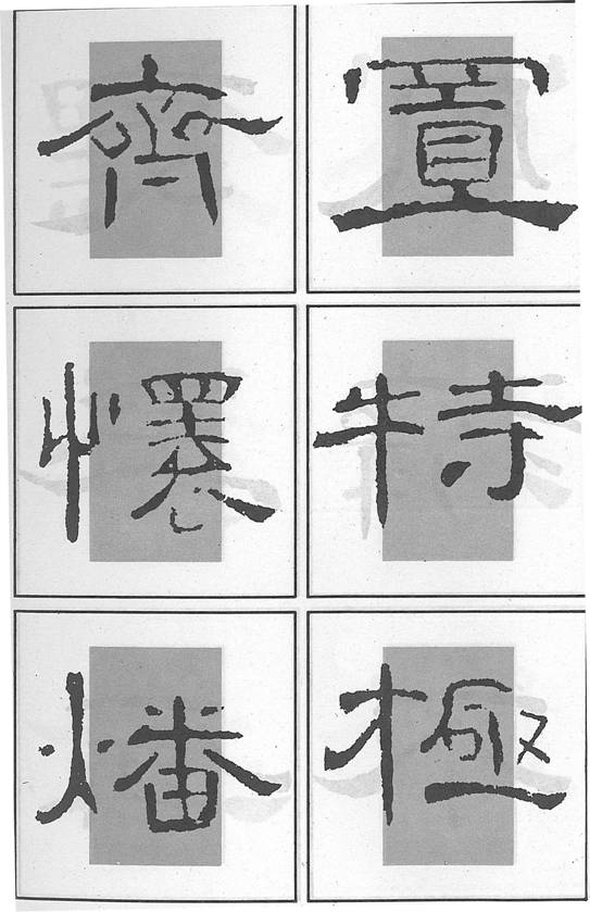
Structure of a Character
Structure of a character refers to the way strokes are composed to form a character. In clerical script, generally speaking, the character should look even and upright, horizontal, left and right stretching strokes can be extended while vertical strokes should be contained.
After you have laid a solid foundation, you can try some “risky” strokes, and then find a new balance and make the character look even and upright again.
Characters are divided into those with radicals and those without.
Those with radicals break into 6 categories, namely: (1) left and right; (2) upper and lower; (3) left, middle and right; (4) upper, middle and lower; (5) wholly enclosed; (6) semi-enclosed.
Placing of White Space and Density of Strokes
Placing white space refers to the comparison between black strokes and the white space left and the white space between characters and lines. Leaving a proper white space on the paper gives a holistic beauty;
Attention should also be paid to the density of strokes, and come to know where strokes should be kept apart or closer.
Inter-relations among Strokes and Charm
Inter-relations among strokes refer to the final posture of the composition of strokes, that would include placing of white space, directions strokes face, open or closed parts and etc.
Charm is usually produced by a combination of the calligrapher’s concept and his skills; such a combination can also projects the state of mind of the calligrapher.
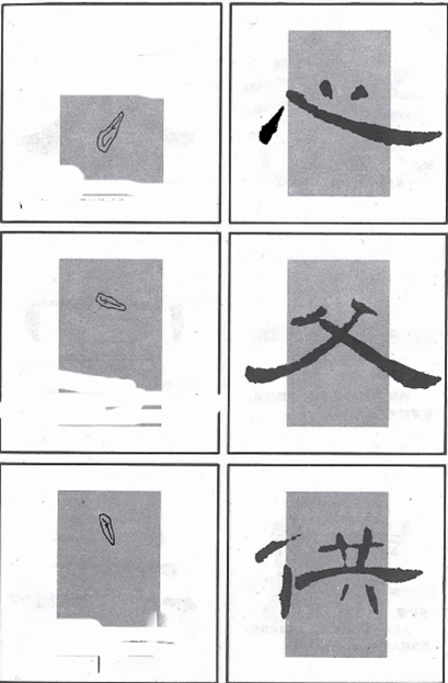
Imitation and Copying
All calligraphers, almost with no exception, started their learning from imitating or copying widely recognized rubbings from stone inscriptions and model calligraphy on paper.
To imitate is to try to write the strokes and follow the structure of the rubbing that is placed before you as closely as possible.
To copy is to write, on a rather transparent paper over a model, as closely as the characters on the model.
You got to read the rubbings or models first before imitation, and study how the strokes are written and what the structure is.
When you imitate for the first time you should get the strokes right;
When you imitate for the second time you should get the structure right;
When you imitate for the third time you should get as closely as possible to the sample;
When you imitate for the fourth time you should ensure the strokes and structure look full and beautiful;
When you imitate for the fifth time you should instill liveliness into your writing.
There are three ways of copying:
One is to fill in the ink onto the double contour lines of a character;
One is to copy from the sample underneath your paper;
The other is to cover the red color strokes with black ink.
Writing of Strokes
 Slanting dot (1): starting with tip-out and moves down to the left while increase strength; raise up slowly when finish it off;
Slanting dot (2): starting down with tip-out, move to the right with the middle part of the brush;
Slanting dot (3): starting down with strength and raise up when finish off.
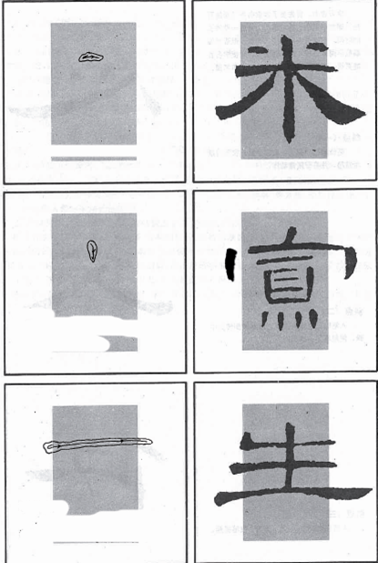 Horizontal dot: start with tip-in and move to the right with the middle part and finish off lightly;
Vertical dot: start with tip-out and strength, which gradually reduces and the pen is slightly raised at finish;
Long even horizontal: starting with strength and tip-in and move to the right with the middle part of the brush and finish off lightly.
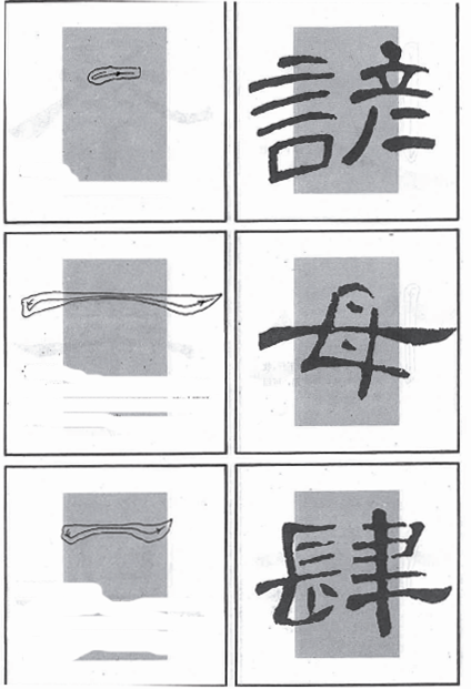 Short horizontal: starting with tip-in, move to the right with the middle part of the brush and finish off lightly;
Long curving horizontal: starting with tip-out and strength, then raise up a little, move to the right with the middle part as a slight curve, press down the middle part and then raise up and finish off to the upper right;
Short curving horizontal: same process as above, only that the upper part of the stroke should be kept even and the lower part as a curve.
 A long vertical (1) : starting with tip-in and move down with the middle part and light at finish;
A long vertical (2): starting with tip-in and move down with the middle part, press down slightly to the left and raise up with tip-in;
Left vertical: start with tip-in, move down to lower left, the stroke arches out a little bit to the right.
 Right vertical: starting with the middle part, pause a bit and then move to the lower right, it arches out to the left.
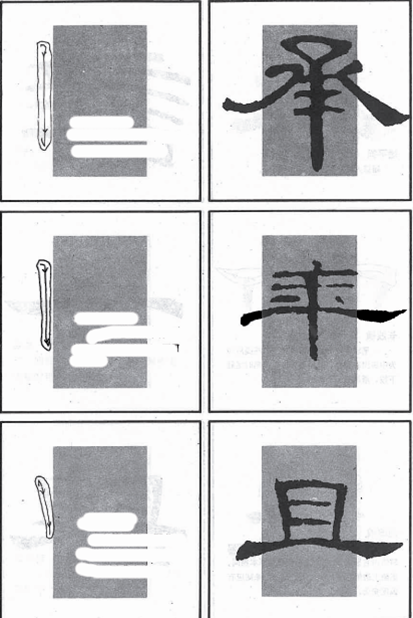
Long left stretch with a bend: starting with tip-in, move down, turn to the left with the middle part; pause at the finish and with tip-in.
Shorter left stretch with a slight bend: starting with tip-in, move to the lower left, press down at the finish and with tip-in.
 Long left stretch that tips off at upper left: starting with tip-in and move to the lower left with a slight bend, press down slightly and tip off at upper left.
Short left stretch that tips off at upper left: starting with tip-in and move to the lower left with a slight bend, press down hard in the middle and then tip off at upper left.
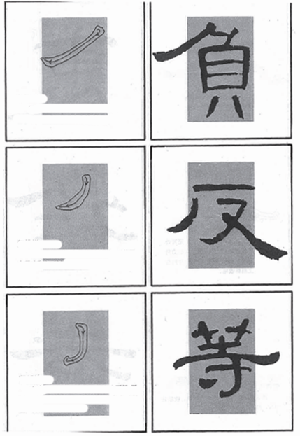
Left elbow: starting with tip-out, raise up a bit and move down and turn to the left, finish with tip-in.
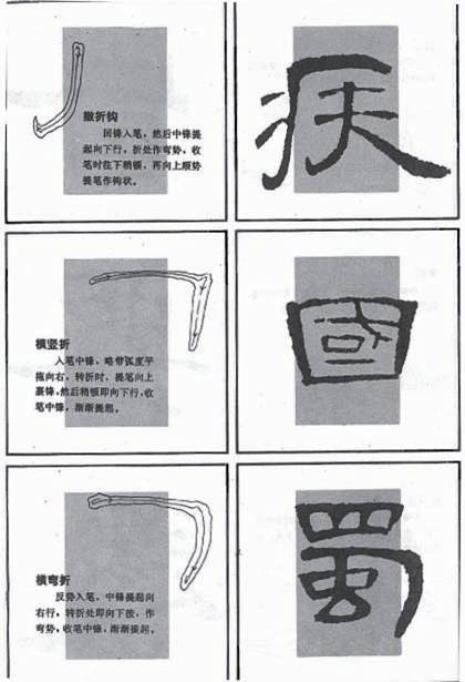 A left stretching hook: starting with tip-in, move down and bend to the left, press down at the finish and finish with tip-out.
An upper right elbow: starting with tip-out, move to the right with a slight bend, raise up at the right end and then press down and finish with tip-out.
An upper right bend: starting with tip-in, move to the right, press down at the bend, move down slightly to the left, raise up at the finish.
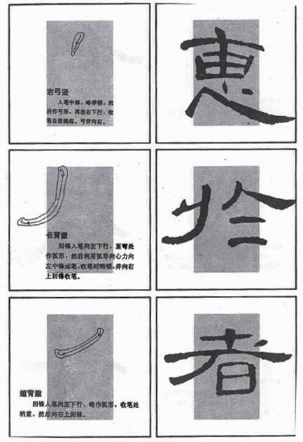
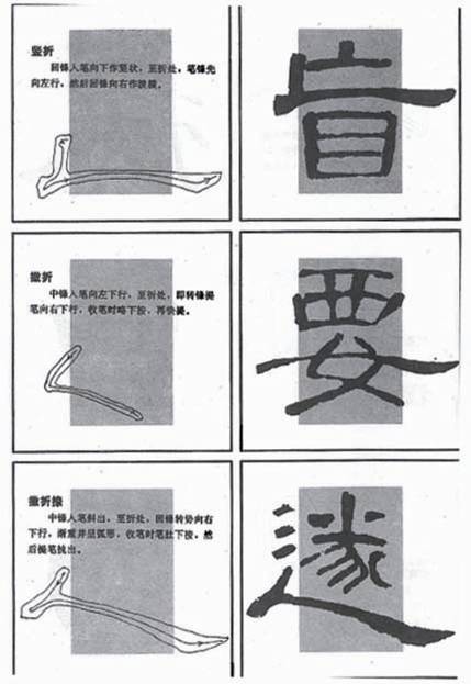 A “L”: starting with tip-in, move down and move to the left a bit and then move to the right and tip off at the upper right.
A short slanting “L”: starting with tip-out, move to lower left, turn the tip at the bend and move to lower right, press down at the finish and finish with tip-out.
A long slanting “L”: starting with tip-out, move down and turn the tip at the bend and move to the right and increase strength while moving, press down at finish and then tip off.
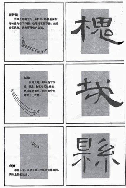 A right stretching hook: starting with tip-out, move down to the bend and press to the left, turn the tip and move to the lower right, press down at the finish and then tip up.
A right stretching stroke: starting with tip-in, move to lower right and increase strength as moving down, press down hard at the finish and then tip up.
A right stretching dot: starting with tip-out, move to the lower right with increased strength and tip up at the finish.
More on Writing a Dot
A dot is the basis of strokes. Dots in clerical script, such as slanting dot, horizontal dot, level dot, vertical dot, left stretching dot and round dot are different from dots in other scripts, they are very often finished with tip-out, they are evenly placed if there is a ray of them.
More on Writing a Horizontal
 A horizontal stroke in calligraphy is like a beam in a house. There is an even horizontal stroke and a curving horizontal stroke. For the former, the beginning end is heavier; for the curving one, both end is heavier and the middle part is lighter and curves. The beginning end is described like the head of a silkworm and other end like the tail of a wild goose. However, there can be only one curving horizontal in any one character.
More on Writing a Vertical
A vertical usually props up a character. There are longer and shorter ones. The upper part is often heavier.
More on Writing an Elbow
An elbow in clerical script tightens up the structure. You have to turn the tip either directly or you raise up and then turn at the bend.
More on Writing a Left Stretching Stroke
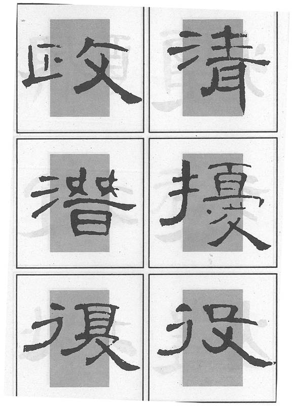
 A left stretching stroke acts like a foot in a character. In clerical script, it is heavier in the lower part and it often curves. Most of them finishes with a pause and tip-in. Its length is decided by other parts of the character in consideration of balance.
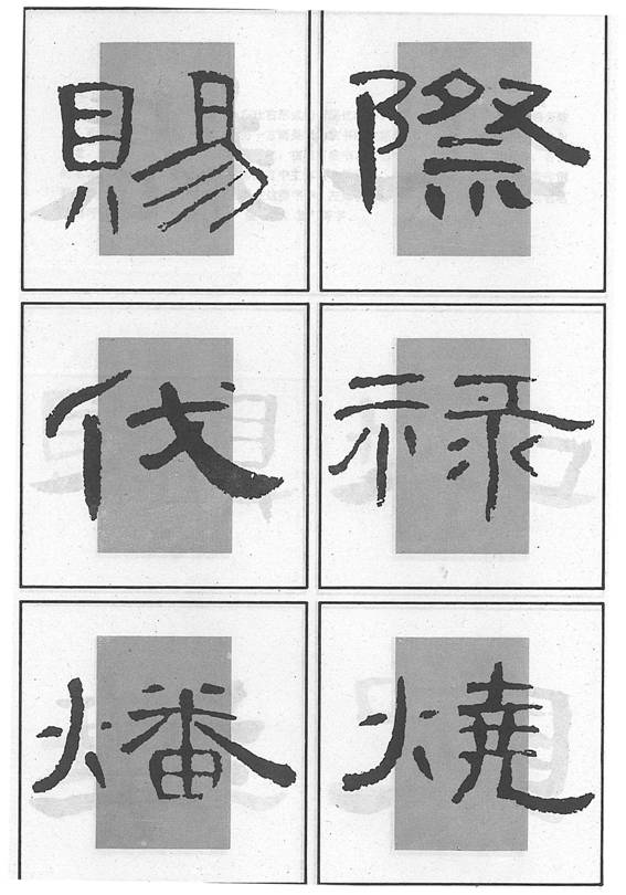
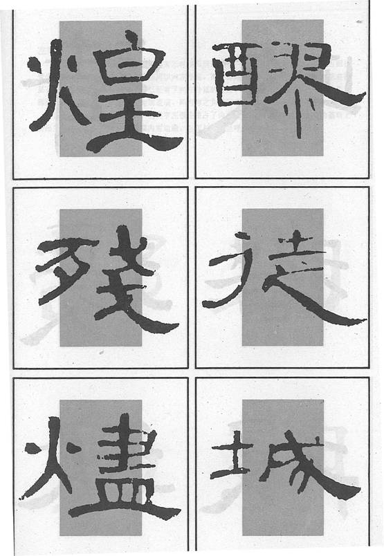
A 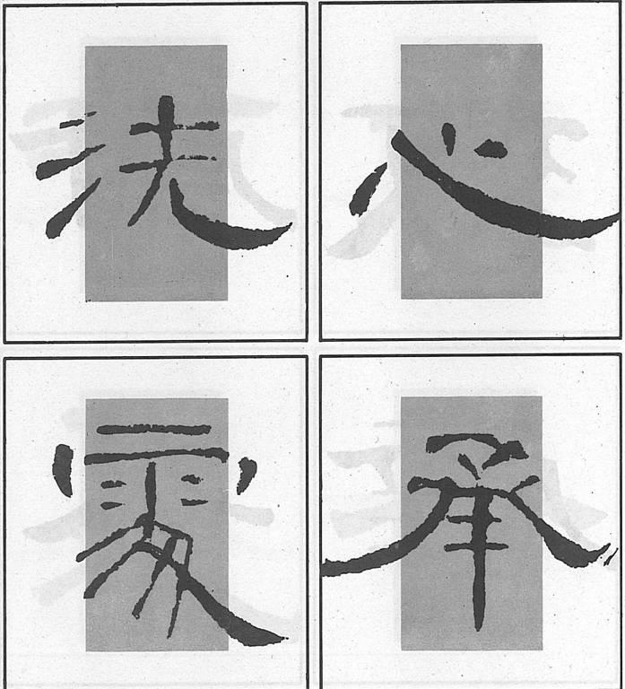 right stretching stroke is the other foot in the character. In clerical script, it is the back bone. Hooks that extend to the right have been written like a right stretching stroke in clerical script.
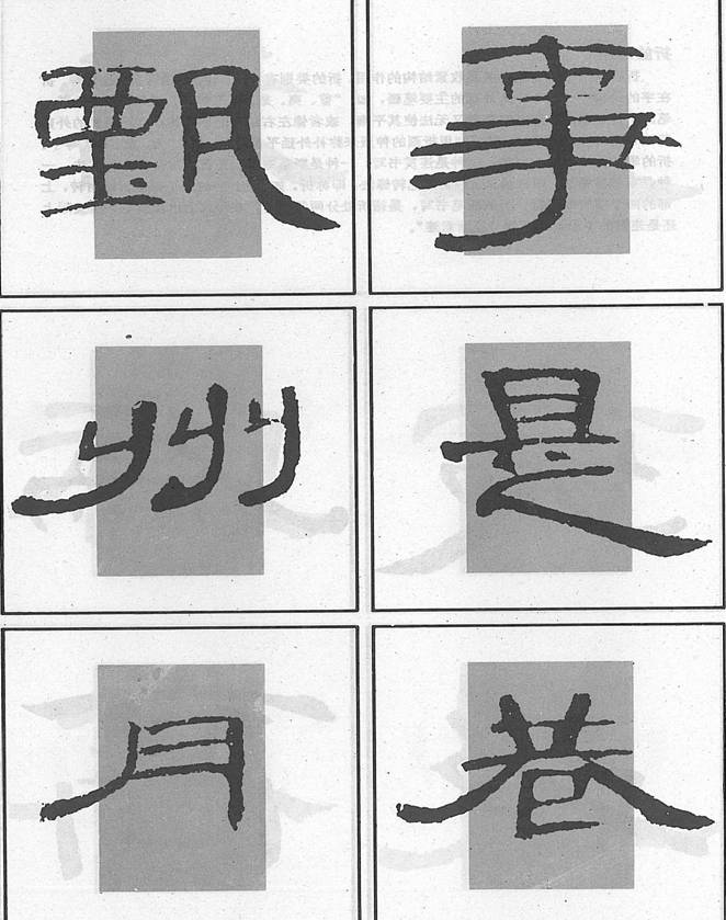
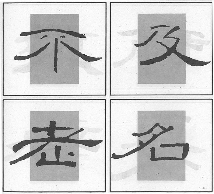
Structure without a Radical
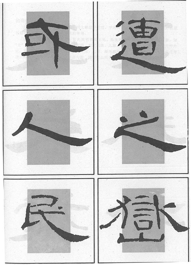
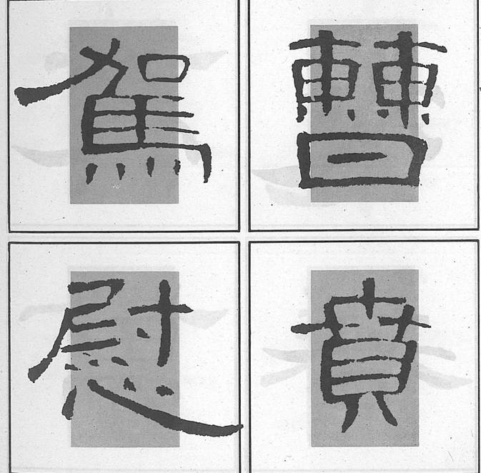
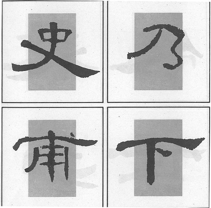 For characters without a radical, their main part should be kept in the inner box. We have to make sure which are the major strokes in a character, for instance, in “史”, the left and right stretching strokes are the main ones, which would extend out of the inner box. If there are no left or right stretching strokes in a character, the horizontal should extend out of the inner box. If there are left and right stretching strokes and a horizontal, the horizontal usually remains in the inner box.
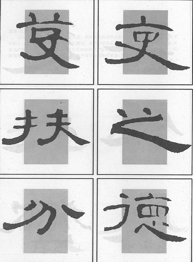
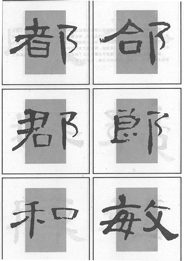
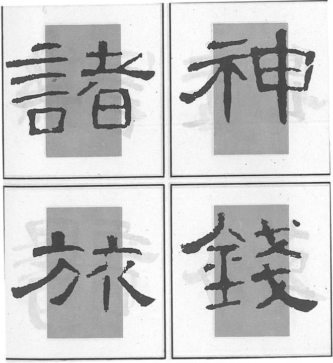
Right and Left Structure (The left gives way to the right)
 In the right and left structure in clerical script, the left part quite often gives way to the right, because the left is often where the radical is, and radicals are usually smaller; the other reason is that in clerical script, the curving horizontal or the right stretching strokes all extend to the right. Therefore, the left part is often outside the inner box and at the same time, the main portion of the right part is in the inner box. The strokes that extend out of the inner box play the role of balancing.
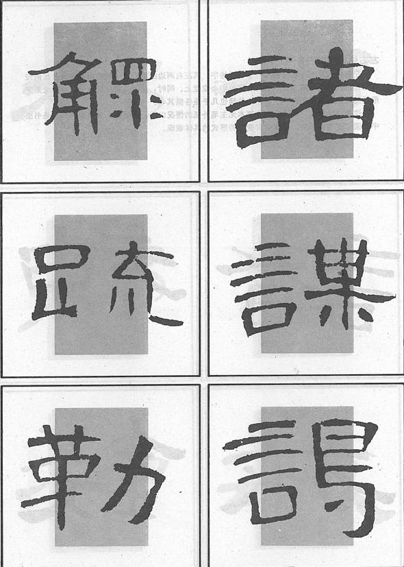
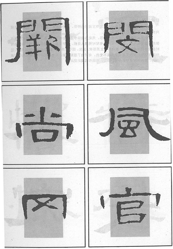
 In the following three cases, the right part gives way to the left: (1) the radical is on the right side and takes up a smaller space; (2) strokes on the left have to go outside the inner box and strokes on the right don’t have to;
 (3) There are strokes on the right that can be extended outside the inner box, but the left part has done so and has occupied a good portion of the space.
Even though the right part is on the edge of the inner box, it should correspond well to the left.
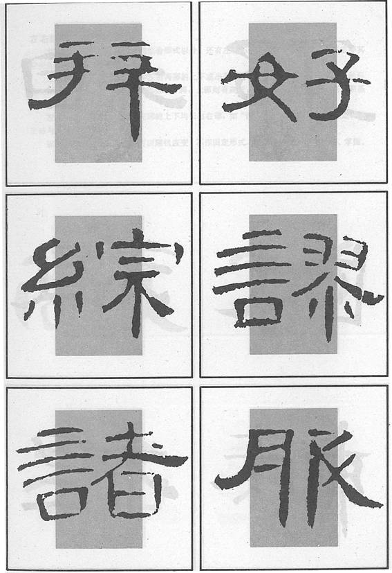
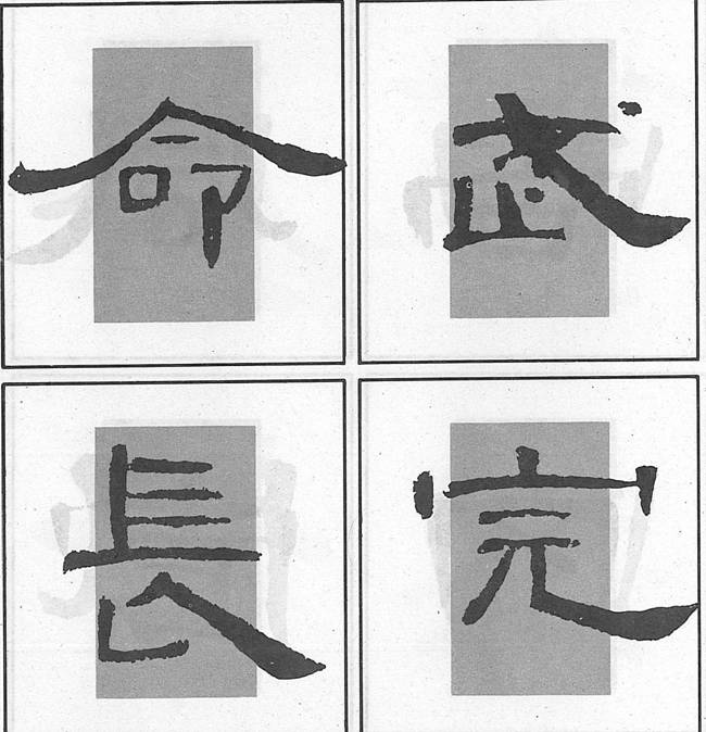
 In such a structure, each part occupies an equal space in the inner box; the demarcation line is in the middle.
Other Forms of Left & Right Structure
 There are such structures in which the left part is not on a par with the right; or the left is longer than the right or vice versa.
Left, Middle & Right Structure
 Of course, the middle part is always in the inner box. But, if the left part extends out of the inner box, the middle part would be closer to the right edge of the box; if the right part extends out of the inner box, the middle part would be closer to the left edge of the box.
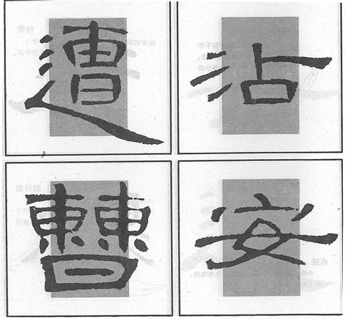
Upper & Lower Structure
 If the upper part extends out of the inner box, the lower part remains in the box; if the lower part extends out of the inner box, the upper part remains in the box; there are also cases when both parts extend out of the inner box
.
Upper, Middle & Lower Structure
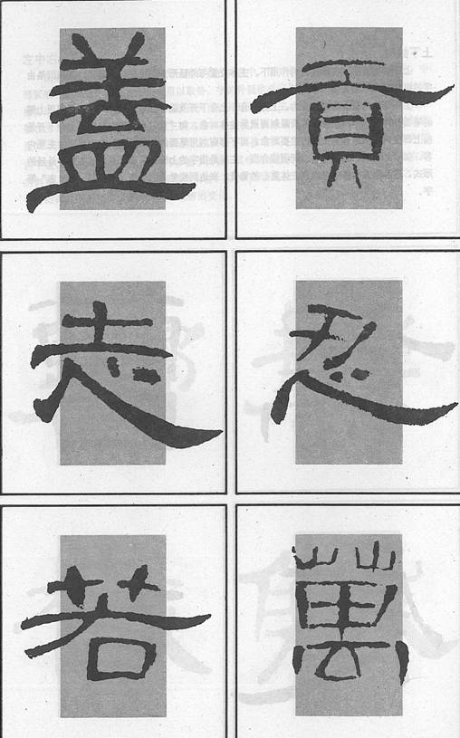
 In such a structure, strokes in two parts may extend to the left and right, like “慕 ”、“薴”and “膏”. But the main part should be kept tight;
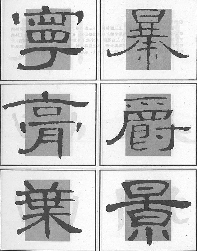 There are also cases when only one part extends to both the left and the right, such as “暴” and “景”.
Enclosures
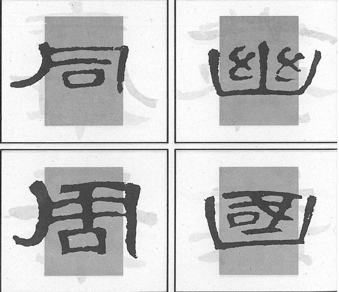 There are 4-sides, upper 3-sides, lower 3-sides, left and right enclosures. The enclosing strokes are often outside the inner box and the enclosed part is the main part of the character.
 Normally, the extending strokes should be on the edge of the box, if they are too far away, the character would look loose; if they are too close, the character would look rigid. More practice is needed for putting them properly.
More on Structure
 In general, clerical characters are flat, therefore, horizontal or slanting extensions are important.
 In general, clerical characters are flat, therefore, horizontal or slanting extensions are important.
